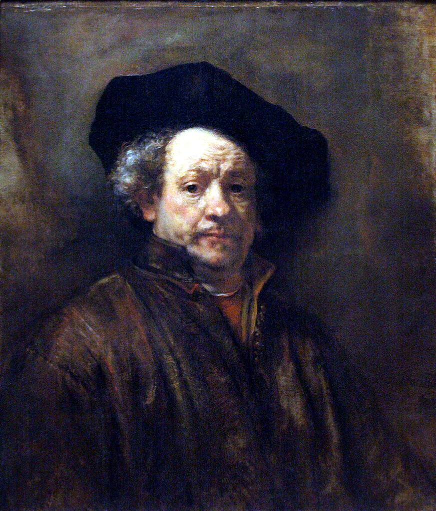
Many people outside of the arts find carrying on a conversation with Artists, Designers, Musicians, Writers, and even Architects, rather obnoxious.
I don’t blame them.
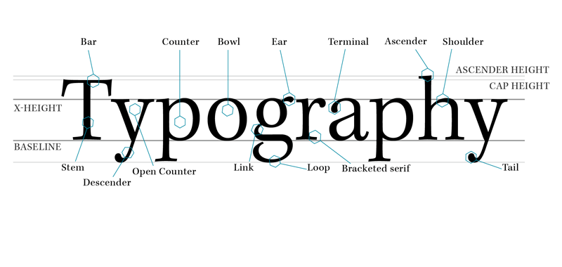
We have a language that we speak, that while it uses words from our mother tongue, is hardly intelligible to the uninitiated. It sounds like English, but if you have ever talked to a passionate designer about fonts, for instance, you know those words don’t mean what you think they mean.
Elements of Composition
Ask any artist what the elements of composition are, and you will get a list of items similar to the following:
-
Unity
-
Balance
-
Rhythm
-
Contrast
-
Repetition
-
Proportion
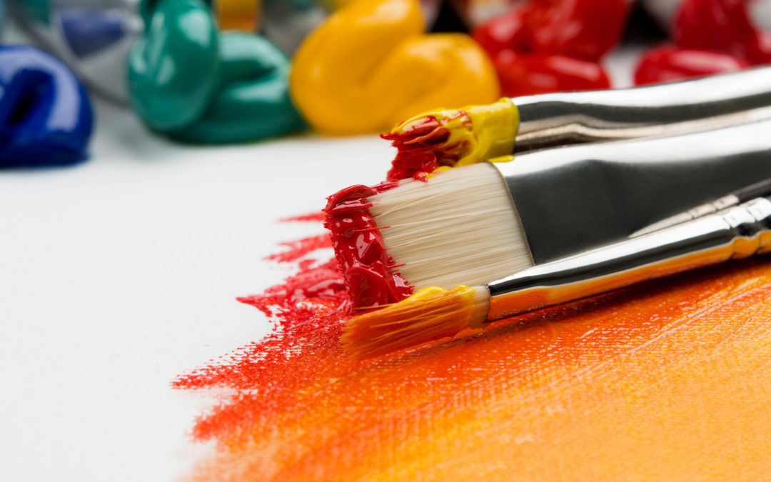
Some may add or subtract one or more items but this covers the basics. These are the fundamental tools that we use when composing a piece. Take away the computers and design software and hand me a pencil and paper and these are the fundamentals I fall back on.
Designers will often provide their own limits, for instance, using only two fonts, or three colors, and then rely on these fundamental elements to make a piece that is both strikingly visual and clearly informative.
Here are some basic definitions of the elements of design. Which of these do you currently use?
UNITY
Unity is the overarching feel of a composition. It is hard to define but jarring when it is missing. More than the other elements unity is most tied to the style and aesthetics of the individual creator.

BALANCE
Balance is the weight of the piece from side to side and top to bottom. Balance is not always symmetrical and when best displayed in a piece it is rarely symmetry.
RHYTHM
Rhythm is the movement within a piece and where the eye wants to travel.
CONTRAST
Contrast is the strength of the difference between values, colors, size and shape.
REPETITION
Repetition is the use of the same feature. It can greatly contribute to the rhythm and movement of a piece, or provide a clear path, or greater emphasis. Repetition paired with contrast can greatly increase the visual impact of information on a page.
PROPORTION
Proportion is the relationship between the sizes of different elements in a page or image. When done right it often goes unnoticed when done poorly it is obvious.
I hope you will be able to put some of these in practice when you are creating your next advertisement, social graphic, or print piece. Tune in to my next blog in this Graphic Design 101 series all about Whitespace!
If you’d like help with any graphic design, don’t hesitate to give Barnyard Marketing a call!