
f you have spent time working with graphic designers like me, you probably know that we love white space. I mean…we really, really love white space.
As a business owner, you most likely want to use every little bit of space on that ad or magazine page that you can. Printing costs money; why waste that space, and why do all these designers keep insisting on leaving all of this blank space!?
Let’s start the white space conversation by defining “visual hierarchy.”
What is Visual Hierarchy?
Visual Hierarchy is a fancy science term for the way that the eye of a viewer travels. It can be applied to paintings, designs, and even nature. Modern scientific studies have tracked the eye movement to show proof that the eye moves in the way artists have known it moves since long ago. Until a German Gestalt psychologist in the 20th century said so, no one outside of the arts cared.
Visual Hierarchy is created using the elements of composition that we just discussed. The designer decides what should be important and arranges the components of the design in such a way that the place your eye travels follows a path of importance, or the visual hierarchy, before they have read a single word.
What I am admitting here, and hopefully it won’t get me kicked out of the club, is that good designers manipulate you to look where they want and in the order that they want you to look.
Oftentimes, we let the visual hierarchy get out of hand. This leads to a page that looks like every pretty element they could find was thrown on the page.
Like this:
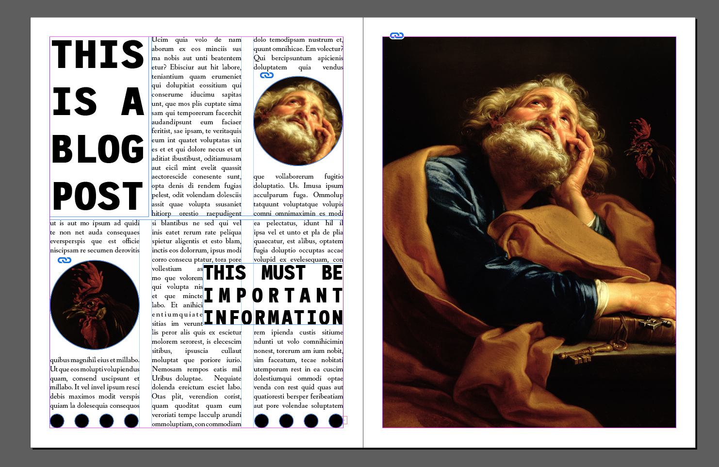
I don’t know about you but this makes my eyes hurt. The large text is fighting for attention, the circle images make the eyes jump around the page, and the black circles, though interesting, add nothing but activity to the page.
It is busy; too busy.
More importantly, there is nowhere to rest. The visual hierarchy is cyclical. The eyes dart from here to there and after touching every element on the page dash back to the beginning to start anew.
I’m exhausted by looking at it in a matter of seconds. The elements are there, but they lack something.
White Space
Most designs struggle with the use of white space. White space gives your viewer a break without looking at something other than your marketing materials. It is a comforting place for the viewer. For the artist and designer, white space is the warm blanket that we wrap your target audience in to leave them happily viewing your brand and hopefully considering becoming your next sale.
Let’s revise the last example and take away some chaos and add some white space and see what happens:
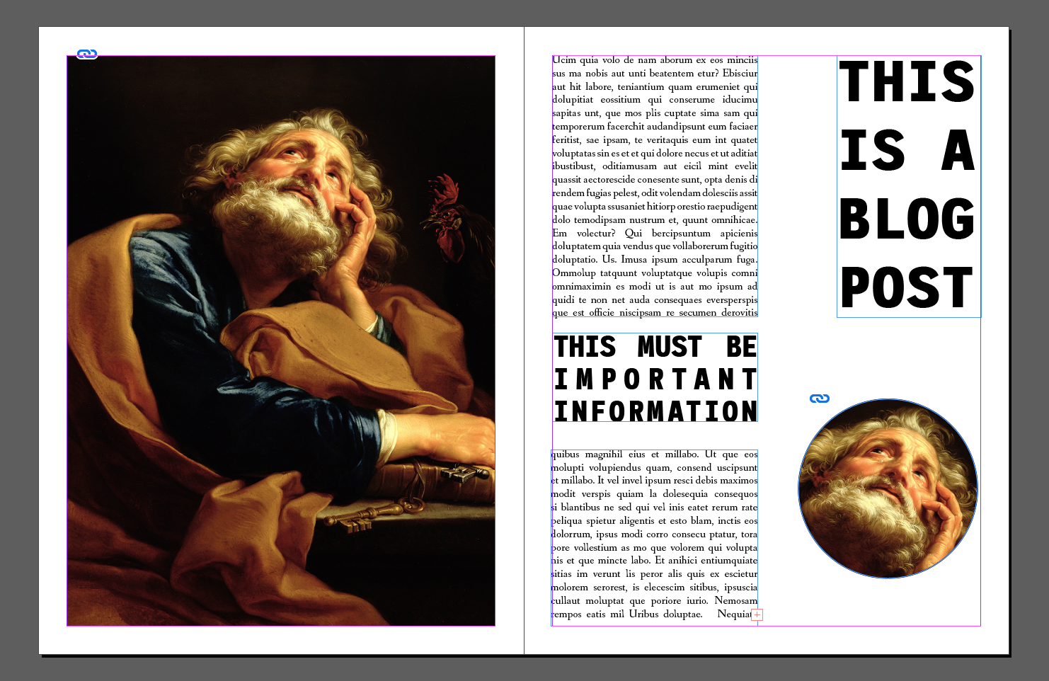
We read left to right, top to bottom. In this Batoni painting of Saint Peter, the composition is such that the viewer is drawn toward St. Peter’s eyes. From here, a diagonal draws the viewer to the smaller saint in the corner who happens to be looking up at the important title: “This is a blog post”.
From here, we are drawn to the “Important Information.” And then this is where the magic happens.
Instead of bouncing back and forth from one St. Peter to the other and one important message to the other, the eyes will naturally find a resting spot in the white space between all these important messages. It is not a huge difference on the page, we lost very little. What we gain is a viewer that will be willing to continue looking at this page without discomfort.
In conclusion, when you start out designing an advertisement or print piece, start by defining your goals. What do you want your audience to do? From there, use the elements of design to draw your view to your important messages. And remember, white space is your friend!
Does your business need help with graphic design that will convert your audience to customers? Barnyard Marketing would love to help. Contact us today to schedule a phone call or meeting.